What’s the one phrase that’s stuck to you? A stranger’s saying, a fine quote, maybe that one liner of a song. Although short and or small, some in effect, last in the longest run. Outdoor advertisement is but one of the top billboard tips, too. In billboarding, you must recognise the attention as well as attentiveness span of intended audiences. To have your image designed to leave impressions in the minds of your consumers.
A one liner works because of its precise timing & perfect transmission.
Come to us to smoothen your deliveries!
What Smarts And What Sucks? Billboard Tips To Tell Apart.

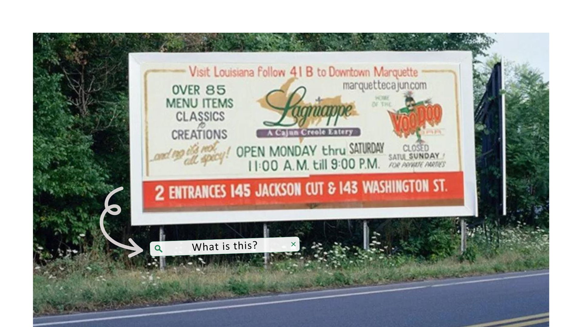
What is this? In spite of the calming earth tones and red tints, from which and where do we start? Billboard tips to bear in mind is the large length of audiences, enlargement and minimalism into a permanent catchphrase and or to make a name of the corporation, not both. And the design right here, is a poor example of such a composition, the cluttered letters in a hash can stump consumers.
A billboard advertising displays a brand’s services and staples, and while this specific billboard is short, it is not sweet. Nonetheless, it pressures customers to question the head and the tail. Sour much?
Searching for other Out-of-Home concerns?
Pop by our oOHmatters for a perfect dose of inside insights!
For an ad without visuals, this billboard does not lack its charm towards specific individuals. The headline above is bright in its signature colour: yellow, as it is brilliant in its phrasing, the figure of speech is superb.
As a platform in romance, Bumble is remarkable at meeting the needs of the singles and searching. The simple subject speaks out to a particular public, for instance, Bumble chose ‘workout’ instead of ‘work out’. Such a style represents both layers of meaning, but it gravitates to those who share similarly strict routines in sports. Along with their signature shade, the short and sweet caption catches more interested eyes to its services as well as to its business.
Should a business named its own catchline, it is expected to stick in the long run. Reason for this is to secure your ownership, holding credentials to its label. For a billboard advertisement to do its trick, there must be an earmark to settling on a catchphrase and or a capture that presents your brand to all audiences.
Take this billboard from McDonald’s, the centerpiece of a visual is made of fries, bent into a capitalised letter ‘M’ to highlight the first character to their trade name. Next to it is a featured slogan, ‘I’m lovin’ it.’ that represents their established marque. Notice the phrase is short as it is sweet to read? This is one of the best billboard tips to master!
Sounds too good to be true?
Come to us! Let us step in, a helping hand is better than none!