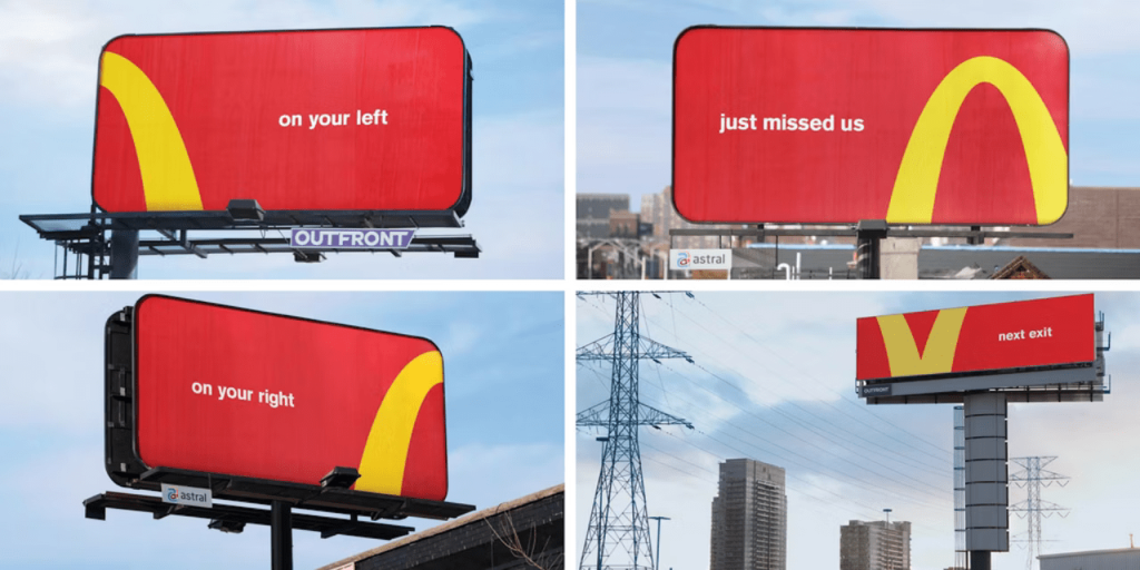
Have you seen how those giant golden arches became so iconic? Well, hold onto your fries. Because we’re about to dive into the world of McDonald’s billboards and how they turned their logo into directional billboards!
Minimalism Is Key
When it comes to catching the eye, McDonald’s has mastered the art of less is more. Their directional billboards are a prime example of how simplicity can be striking, drawing in hungry customers with just a few well-placed elements.
At first glance, a McDonald’s billboard might seem deceptively simple. You’ll often see just three key components: the iconic golden arches, a mouth-watering image of their most popular menu item, and a short, snappy slogan. But don’t let their minimalistic approach fool you – there’s a lot of thought and strategy behind every billboard.
One of the key benefits of minimalism is clarity. By keeping their message concise and uncluttered, McDonald’s ensures that viewers can quickly understand what they’re promoting. Whether it’s a juicy Big Mac or a refreshing McCafé beverage, the focus is always on the product itself, with no distractions to dilute its impact.
Minimalism is one of the ways to design a captive visual.
But if you need guidance on that, shoot Firstboard’s media specialists an email today!
Follow The Fries
Cossette’s campaign ingeniously transforms McDonald’s golden arches into directional billboards. This leads hungry travellers straight to their nearest restaurants. Dubbed the ‘Follow the Arches’ campaign, it cleverly removes the brand’s name, leaving only a portion of the iconic logo. This simple yet effective strategy provides drivers with clear and easy-to-follow directions, ensuring a seamless journey to satisfy their cravings.

In Toronto, the ‘Follow the Arches’ campaign features four strategically placed billboards – three static and one digital – guiding locals and visitors alike to nearby McDonald’s locations. If this innovative campaign proves successful in its hometown, there are plans to extend its reach globally, bringing the convenience and simplicity of the golden arches’ directional guidance to hungry patrons worldwide.
Of course, McDonald’s isn’t the only brand to embrace minimalism in their advertising.But what sets them apart is their unwavering commitment to simplicity, even as other companies chase after flashy gimmicks and over-the-top designs. In a world where less is often overlooked in favour of more, McDonald’s reminds us that sometimes, all you need is a golden arch and a mouth-watering burger to make a lasting impression.
Your favourite snack starts with an F? Is it fries? Same!
Do you know what else starts with an F? Your trusted advertising agency.
Image Credits: The Drum


