If you aim to make people stop and stare, the first step is to catch their attention. How to do that? Colours. Use the right colours. Spend extra time on your billboard visual.
The Power Of Colour
Colour isn’t just about aesthetics; it’s a powerful tool that can evoke emotions, convey messages, and drive action. In the realm of outdoor advertising, where brands have mere moments to make an impression, the right colour choices can mean the difference between a passing glance and a lingering gaze.
Colour Choices On Consumer Behaviour
Research has shown that different colours elicit distinct psychological responses. For example:
- Red can signify urgency and excitement, making it ideal for promoting limited-time offers or sales.
- Blue exudes trust and reliability, making it a popular choice for financial institutions and healthcare services.
By understanding the psychological impact of colour, advertisers can strategically select hues that resonate with their target audience and compel them to take action. Whether it’s enticing consumers to make a purchase or driving brand recall, the right colour palette can significantly influence consumer behaviour.
Successful Billboard Campaigns (And Their Colour Strategies)
Let’s take a closer look at some successful billboard campaigns and the color strategies that set them apart:
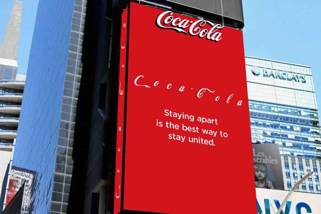
Coca-Cola’s Classic Red: With its iconic red background and bold white lettering, Coca-Cola’s billboards are instantly recognisable. The use of red not only aligns with the brand’s identity but also triggers feelings of happiness and nostalgia, making it a staple in their outdoor advertising campaigns.
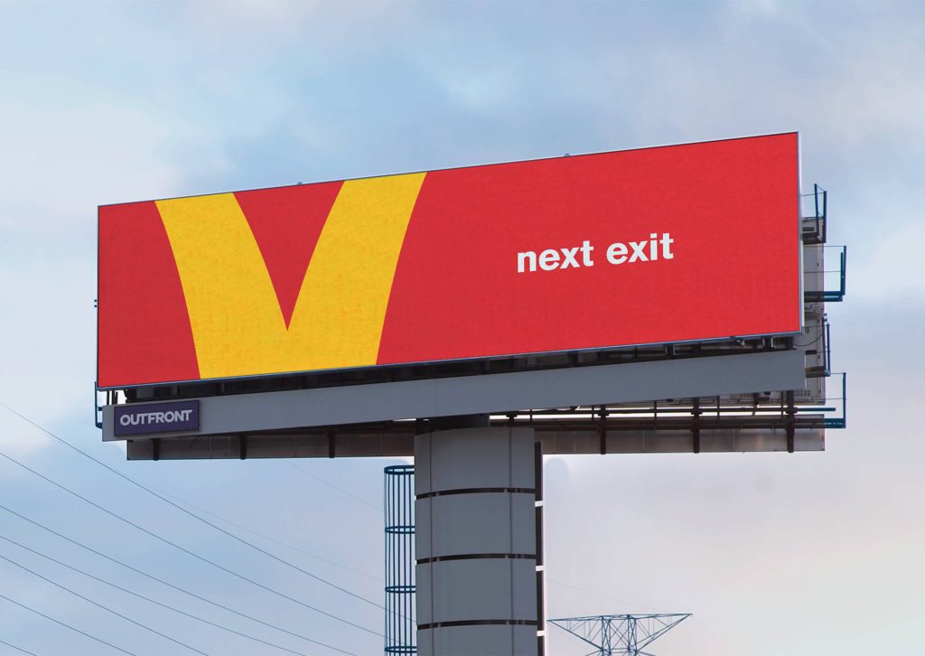
McDonald’s Golden Arch: McDonald’s golden arches are a beacon for hungry travellers on the road. The use of vibrant yellow not only grabs attention but also stimulates appetite, making it the perfect choice for a fast-food giant. Check out their french fries crosswalk at Bukit Bintang too!
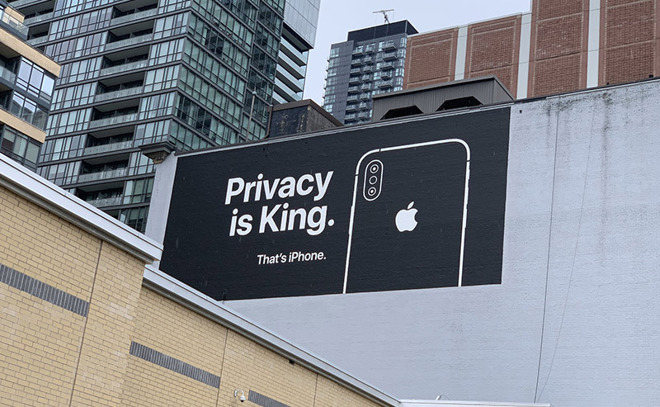
Apple’s Minimalist Approach: In contrast to the vibrant hues of fast-food chains, Apple opts for a minimalist approach with clean black backgrounds and sleek product imagery. This understated elegance not only reinforces the brand’s premium image but also ensures that the focus remains on the product itself.
You don’t have to pick all the colours in the chart. One or two are enough. Remember, when it comes to billboard visual, minimalism is the cool kids on the block!
Get your trusted outdoor advertising assistance in Firstboard!
Image Credits: Ad Age, Ads of the World, 3uTools