There’s no denying the techniques designed and displayed amid the plethora of Out Of Home advertisements in Malaysia. Food & Beverages, Healthcare Foundations, and Sports, on top of Fashion Industries, the scope is inclusive as it is immense. There seems no in between and there shouldn’t be. That being said, this article addresses further perspective as to envisioning a fresh, immersive while immobile OOH design.
“But what’re the differences?! Huh. How?!”
Ask and ye shall be answered, do text Firstboard!
Coke, Anyone?
Starting off with this,

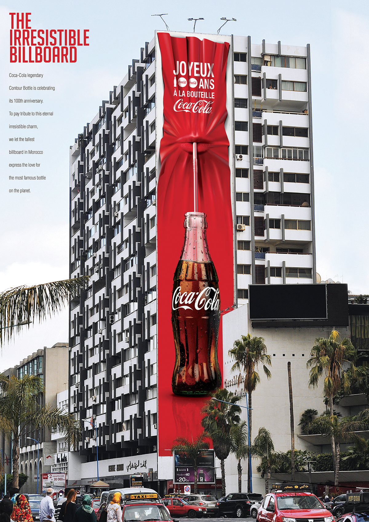
In celebration of its very first appearance, it’s been the 100th since, Coca Cola had struck while the iron is hot. Capitalised on the colossal billboard that is in Morocco, a bright red drape is nothing on the protruding lips. Because as what is unveiled, a sip of the cooling and condensing glass bottle of coke is very much needed. The pitch in this groundwork is impressive as it is immersive, in addition to being an immobile OOH fashion. Therefore it leaves a more influential image of its remarkable designs.
“Let There Be Light!”
Now, this is brilliant marketing.

Like killing two birds with a stone, this billboard advertises nightlights through the touch of a psychological thriller, Dead by Daylight.
This survival game features Alan Wake, a novelist and a hit in crime thriller, is on a search of his wife’s disappearance since a vacation in a little town of Bright Falls. The kicker is that Alan must undergo his freshest piece as it’s come to life, a written work he does not recall composing at all.
Besides the remarkable method in echoing the survival game’s signature style of shading and shadows, portrayed in the coffin–shaped spotlighting, the addition of a nightlight is stunning. Seeing as the advertisement poses a great engagement to those in current use of the appliance, it is nonetheless immersive for an immobile OOH billboard.
Immersive But Immobile OOH To Recognise
Oh, man…

Applause to whose ingeniousness marks and makes such a deserved front, much like our small yet strong survivors, courage as well as creativity have been embodied throughout this happenings. Regardless the obvious blueprint of a billboard, the advertisement stages a string of knotted sheets that reaches over the billboard. The standpoint speaks volume of exit, as it symbolises an escape outside of the bedroom together with the billboard.
This design is dark as it is direct, a taste consumers should have, once in awhile. The immersive billboard leans into an unpleasant degree, yet perhaps it’s the immobile space of this billboard which should be considered instead.
Now that that’s done, what about mobile & immersive OOH?
Check out oOHmatters!
Image Credits: Creative Criminals, Hongkiat, Pinterest, Creative Criminals


