Looking at the renowned brand fame for its red outercoat and bubbling brown draft, Coca Cola’s brand asset: coke, is not the only central focus, but the innovative methods the brand publicises it, too. From creative to convergent, Coca Cola is not afraid to involve itself in other different themes and topics.
Instead of receiving kickbacks, quite the reverse, it’s since been returned with countless interest to their diverting illustrations. And this article is to explore the manifold of styles together with skills that begun in Coca Cola’s advertisement campaign.
A Coca Cola Ad Campaign That Honks!

First off, transit advertising. Honk~
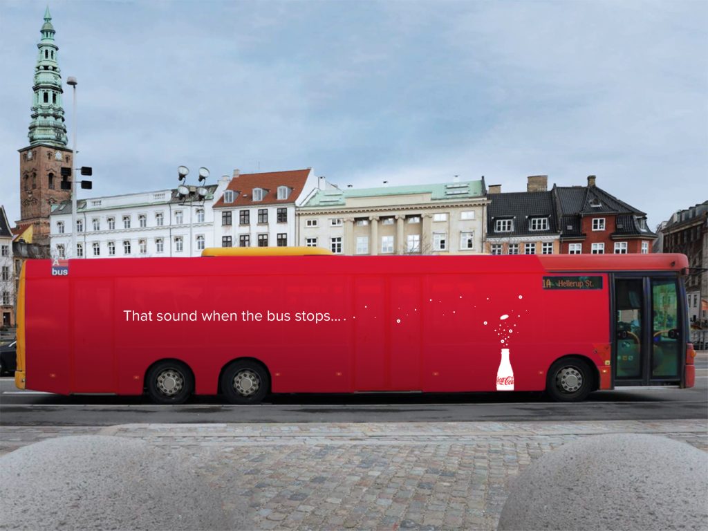
A simple fashion, a secured footprint. This had been a Coca Cola ad campaign of the Danish School of Media & Journalism, students of 2020 had produced it. Headlined: ‘That Sound When The Bus Stops’. Quite a match since the noise of air brakes share a likeness to the fizzing of a coke opening. This mobile as well as moving OOH is an efficient transition of taking one’s attention of to another.
See It? Step To It. Sip It!
Dramatic detailing much? Not at all. Especially not when you can drink from it!
As within ‘You Don’t Know Zero ‘Till You’ve Tried It’ campaign of Coke Zero, this drinkable ad had taken place in the N.C.A.A Men’s Final Four in Indianapolis. In contrast to only a billboard, there were other selections of OOH like flyers, along with DOOH like television ads, and etc. Furthermore, it’s at the March Madness Music Festival that Coca Cola constructed a billboard that is drinkable. A 4,500 feet of thick tubing spelt out: “Taste It.” before a 26 by 36 foot of the billboard.
It’s the meticulous plus measured pumping system delivering Coke Zero that’s gotten the deserved attention, by surrounding the ground of its sample station consumers were then served the drinks. Besides, this is a standard of an immersive yet immobile billboard. Now, that’s one way to market a Coca Cola ad campaign!
Standards In Coca Cola Ad Campaign: The Three R’s
“Distribute it here! Don’t just dump!”
The stark contrast of Coca Cola’s white, and its hand of course, calls an obvious participation amid their regular drinkers. By the very end of its pointer are three red layered recycling bins, the Coca Cola ad campaign couldn’t have been more transparent as such a print interacts just as it involves passersby. A hard to miss of a call into action billboard advertising!
Go Green, Grows Green
Sometimes a little green isn’t a bad change.
And while there’s no red, there’s an empty draft, a signature sketch of Coca Cola’s glass bottle. Best yet, this collaboration campaign with (WWF) World Wildlife Fund has cultivated a billboard rich of leafage. The partnership of two businesses is to contribute in lessening greenhouse gas emissions, playing their hands in bettering climate crisis. The coalition really shows Coca Cola’s presence in a likewise recognisable movements of other campaigns aside from themselves.
Share A Coke Perhaps?
Is there a Matt here?
‘Share A Coke’ campaign goes about a straightforward objective, that is to up the consumption of Coca Cola throughout summer of Australia. And of course, to be the talk of the people, too. Hence, under careful, calculated scales to push Aussies in engaging between one another, in addition to reminisce lost loved ones, the inherent theme to communication stems to orchestrating such an ad campaign. Genius, if you ask me.
Inspired to involve yourself in ad campaigns?
Pop in Firstboard to set ’em up!
Image Credits: Little Black Book, Ads of the World, Campaigns of the World, Creative Bloq, Pinterest, Marketing Mag